
Lab: Optimizing Visualizations and User Interaction
Estimated time needed: 30 minutes.
In this lab, you will add and format tooltips and create a dashboard using hierarchical navigation in Tableau.
Required Software
You can complete this lab using the free, downloadable Tableau Desktop (Public Edition) desktop software. You may also use the free Tableau Public online platform, but some tasks may not work in exactly the same way or may not be supported in that version.
Prerequisites
You need a free Tableau Public account for this lab. If you haven't already done so, you can sign up for an account using the steps here.
Data Set
This lab uses a sample data set called World Indicators Data.csv to showcase the Tableau features used in these lab exercises.
Hold the CTRL key while you click to download the following file:
Objectives
The exercises in this lab teach you how to format tooltips and create dashboards using hierarchical navigation in Tableau.
In this hands-on lab, you will:- Use and format tooltips
- Create a dashboard using hierarchical navigation
Exercise 1: Use and format tooltips
In this first exercise, in Tableau Desktop (Public Edition), you will use tooltips to display additional data. You will need to open the Hierarchies workbook, which you saved to Tableau Public in an earlier lab exercise.
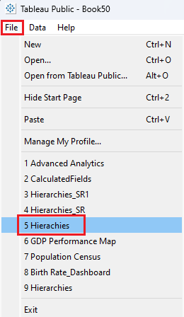
- In Tableau Desktop (Public Edition), in the main menu, click File, then select Hierarchies from the recently used list. This is the workbook that you saved to Tableau Public in an earlier exercise in the hands-on lab Building Hierarchies.
Go to the Map Visualization sheet.
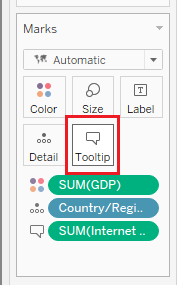
Click on the Tooltip box on the Marks card.
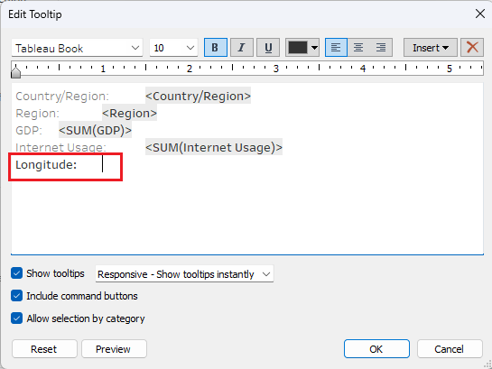
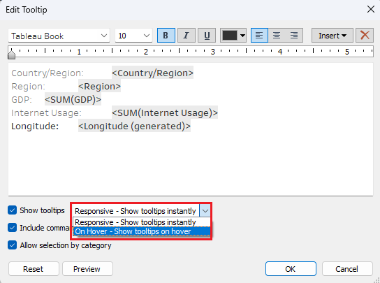
In the Edit Tooltip dialog box, click on the main text box and bring the cursor to the end of the last line, then press Enter to go to the next line.
Write Longitude: at that point and click the Tab key on your keyboard.
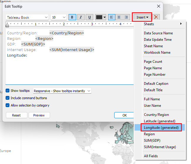
- Click Insert and from the drop-down menu select Longitude(generated).
- In the Show tooltips options drop-down list, select On Hover – Show tooltips on hover, then click OK.
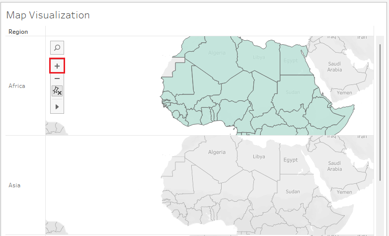
- Hover over the Africa map and click the + icon on the map tools twice to zoom in on the maps.
- Hover over Algeria on the Africa map.
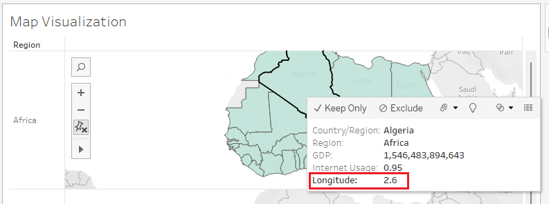
- Now, you can see Longitude information when you hover over a country on the map.
Next, you'll format your tooltips, and add descriptions to your tooltips.
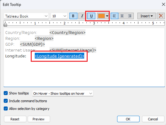
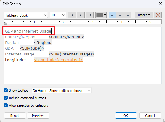
Click Tooltip in the Marks card.
Select the added field <Longitude(generated)>, select Underline (U), select a dark orange font color, and then click OK.
- Hover over Egypt on the Africa map.
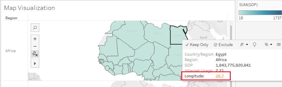
You can now see that the value for the Longitude field is underlined and dark orange when you hover over countries on the map.
Click Tooltip in the Marks card.
Put the mouse cursor at the beginning of the text on the first line and write GDP and Internet Usage, then press Enter.
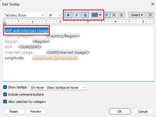
- Select the text GDP and Internet Usage and select Bold (B), Underline (U), and a dark blue font color, and then click OK.
- Hover over Libya in the Africa map.
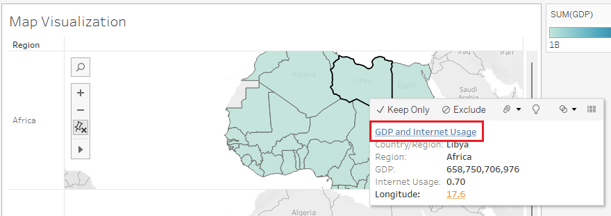
You can now see the heading GDP and Internet Usage in bold, underlined, and dark blue font while hovering over countries on the map visualization.
In the main menu, click File, then Save to Tableau Public.
If you get an error message, just close the error message box and try it again.
If required, enter your Tableau Public credentials and click Sign In.
In the Save Workbook to Tableau Public dialog box, keep the name as Hierarchies and click Save.
In the pop-up dialog box, click Yes to overwrite the workbook.
Exercise 2: Create a dashboard using hierarchical navigation
In this exercise, you will combine multiple visualizations to create a dashboard using hierarchical navigation.
First, you'll use dashboard actions to set up filtering so that selecting a region on the bar chart dynamically updates the map to show data for that region.
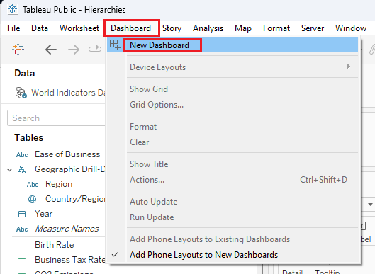
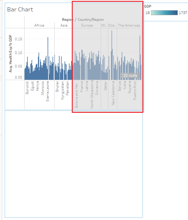
- In the Dashboard menu, click New Dashboard.
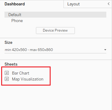
- In the left pane under Sheets, you should see the Bar Chart and Map Visualization worksheets listed.
- Drag the Bar Chart sheet to the dashboard workspace, and then drag the Map Visualization sheet below it.
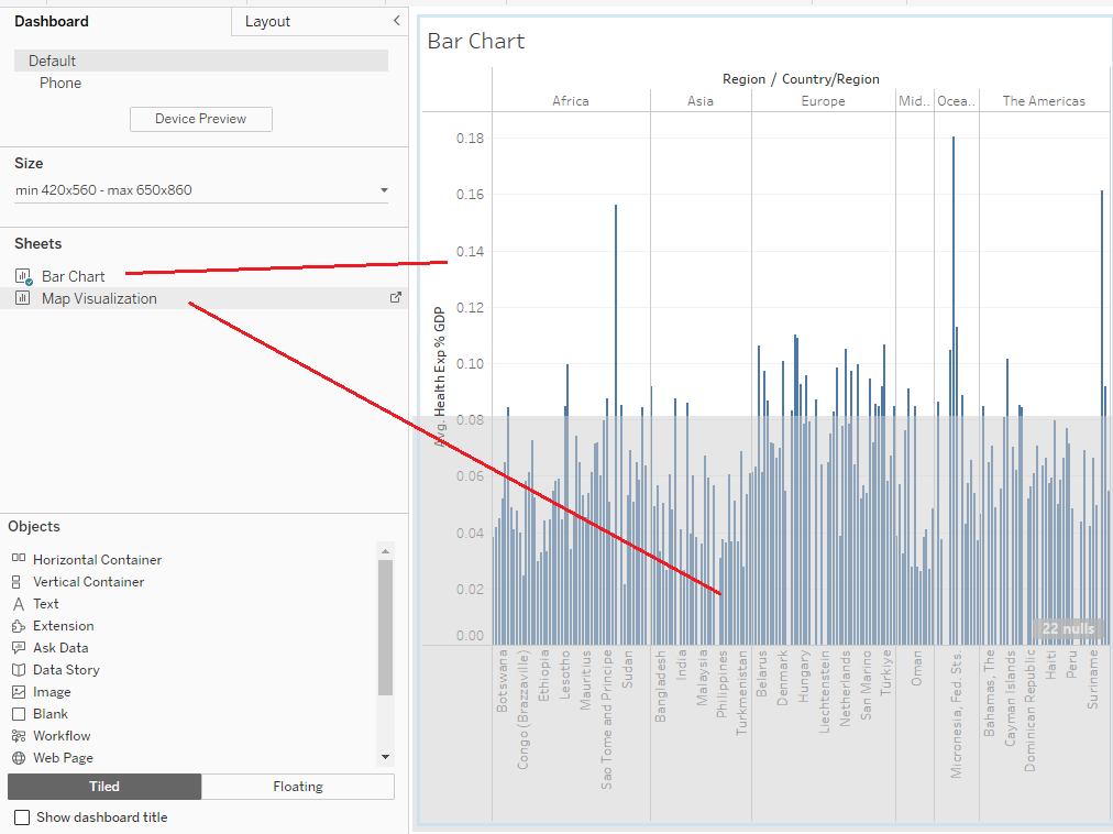
- To position the map and bar chart side by side, select Map Visualization and then hover over the top of it, and when you see the double-crossed white arrow, drag it to reposition it to the right of the Bar Chart in your dashboard.
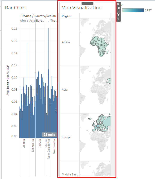
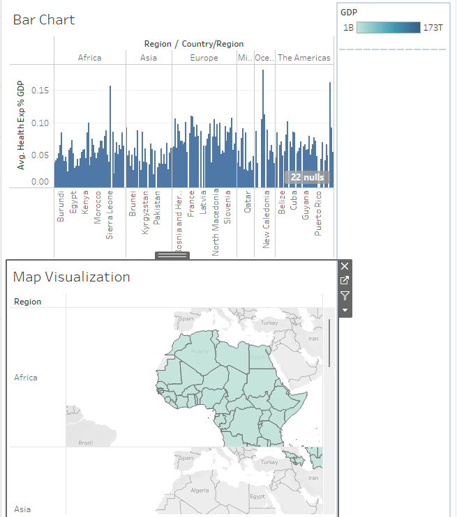
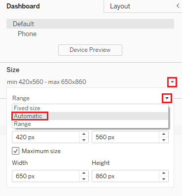
- In the left pane, click the Size drop-down list; in the next drop-down list, choose Automatic. This will make the dashboard area a lot larger.
If necessary, hover over the left edge of Map Visualization and resize it to fill about half of the dashboard area so they are roughly equal.
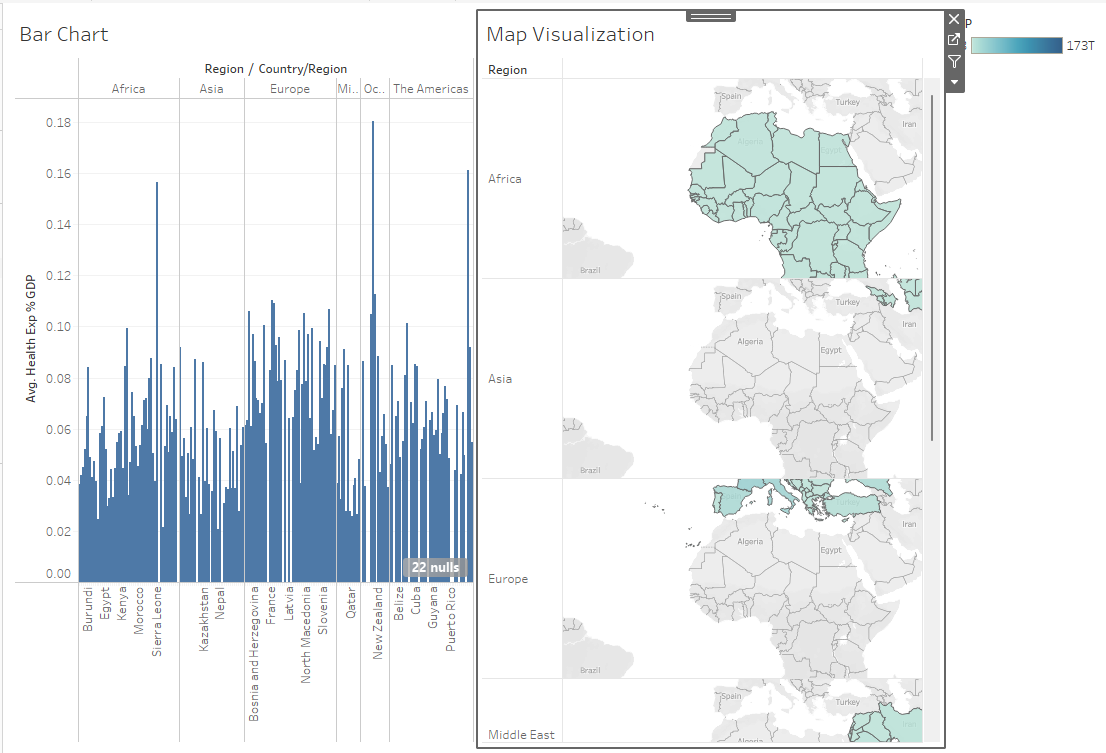
In the Dashboard menu, click Actions.
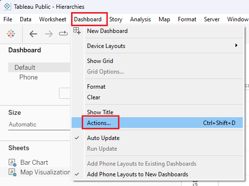
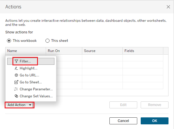
- Click Add Action, and then select Filter.
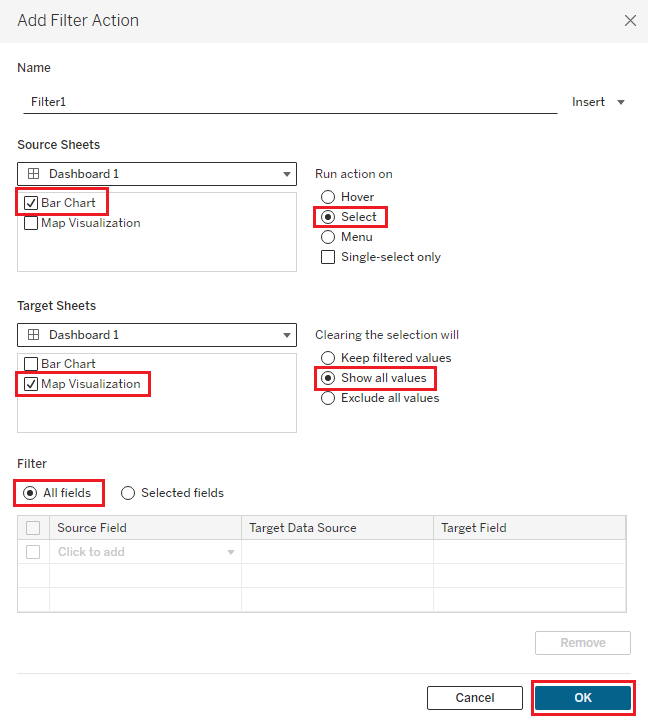
Under Source Sheets, select only the Bar Chart checkbox.
Under Target Sheets, select only the Map Visualization checkbox.
For Run action on, select the Select button.
For Clearing the selection will, select Show all values.
For Filter, select All fields, then click OK.
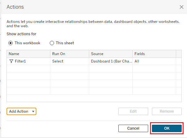
- In the Actions dialog box, click OK again.
Next, you will see your interactive dashboard in action.
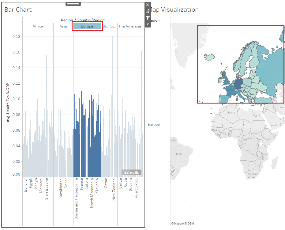
- Select the Europe column in the Bar Chart visualization. As you can see, when you select a region column in the bar chart, it focuses the map on the countries in that region.
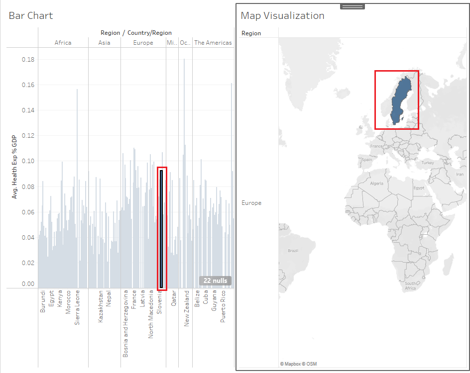
- In the Europe column in Bar Chart, select the bar for Sweden. When you select the column for a specific country in the bar chart, the map focuses the visualization directly on that country.
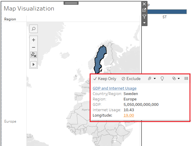
- In the map, hover over Sweden to view the tooltip. When you hover over a country in the map visualization, you can see the tooltip displaying the heading and the GDP, Internet Usage, and Longitude information that you formatted previously.
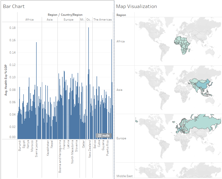
- In Bar Chart, select the Europe column, then click it again to deselect it. If you deselect a region and click outside the selection, then all fields are displayed again as you configured in the dashboard actions.
Congratulations! You have completed this lab and are ready for the next topic.
Author(s)
Steve Ryan